Plotting analysis properties
In this tutorial, we’ll see how to plot properties of an analysis. These include items that go directly into the likelihood, as well as performance figures such as angular resolution. We will be using histlite extensively in this tutorial.
[1]:
import numpy as np
import matplotlib.pyplot as plt
from scipy import stats

import histlite as hl
import csky as cy

%matplotlib inline
[2]:
cy.plotting.mrichman_mpl()
We’ll do these demonstrations with the “point source” 7yr dataset:
[3]:
ana_dir = '/data/user/mrichman/csky_cache/ana/'
ana = cy.get_analysis(cy.selections.repo, cy.selections.PSDataSpecs.ps_7yr, dir=ana_dir, compress=False)
Setting up Analysis for:
IC40, IC59, IC79, IC86_2011, IC86_2012_2014
Setting up IC40...
Reading /data/ana/analyses/ps_tracks/current/IC40_MC.npy ...
Reading /data/ana/analyses/ps_tracks/current/IC40_exp.npy ...
Reading /data/ana/analyses/ps_tracks/current/GRL/IC40_exp.npy ...
<- /data/user/mrichman/csky_cache/ana//IC40.subanalysis.npy
Setting up IC59...
Reading /data/ana/analyses/ps_tracks/current/IC59_MC.npy ...
Reading /data/ana/analyses/ps_tracks/current/IC59_exp.npy ...
Reading /data/ana/analyses/ps_tracks/current/GRL/IC59_exp.npy ...
<- /data/user/mrichman/csky_cache/ana//IC59.subanalysis.npy
Setting up IC79...
Reading /data/ana/analyses/ps_tracks/current/IC79_MC.npy ...
Reading /data/ana/analyses/ps_tracks/current/IC79_exp.npy ...
Reading /data/ana/analyses/ps_tracks/current/GRL/IC79_exp.npy ...
<- /data/user/mrichman/csky_cache/ana//IC79.subanalysis.npy
Setting up IC86_2011...
Reading /data/ana/analyses/ps_tracks/current/IC86_2011_MC.npy ...
Reading /data/ana/analyses/ps_tracks/current/IC86_2011_exp.npy ...
Reading /data/ana/analyses/ps_tracks/current/GRL/IC86_2011_exp.npy ...
<- /data/user/mrichman/csky_cache/ana//IC86_2011.subanalysis.npy
Setting up IC86_2012_2014...
Reading /data/ana/analyses/ps_tracks/version-002-p03/IC86_2012_MC.npy ...
Reading /data/ana/analyses/ps_tracks/version-002-p03/IC86_2012_exp.npy ...
Reading /data/ana/analyses/ps_tracks/version-002-p03/IC86_2013_exp.npy ...
Reading /data/ana/analyses/ps_tracks/version-002-p03/IC86_2014_exp.npy ...
Reading /data/ana/analyses/ps_tracks/version-002-p03/GRL/IC86_2012_exp.npy ...
Reading /data/ana/analyses/ps_tracks/version-002-p03/GRL/IC86_2013_exp.npy ...
Reading /data/ana/analyses/ps_tracks/version-002-p03/GRL/IC86_2014_exp.npy ...
<- /data/user/mrichman/csky_cache/ana//IC86_2012_2014.subanalysis.version-002-p03.npy
Done.
For convenience, let’s hold references to the 2012-2014 SubAnalysis, the real data, and the signal MC.
[4]:
a = ana[-1]
data, sig = a.data, a.sig
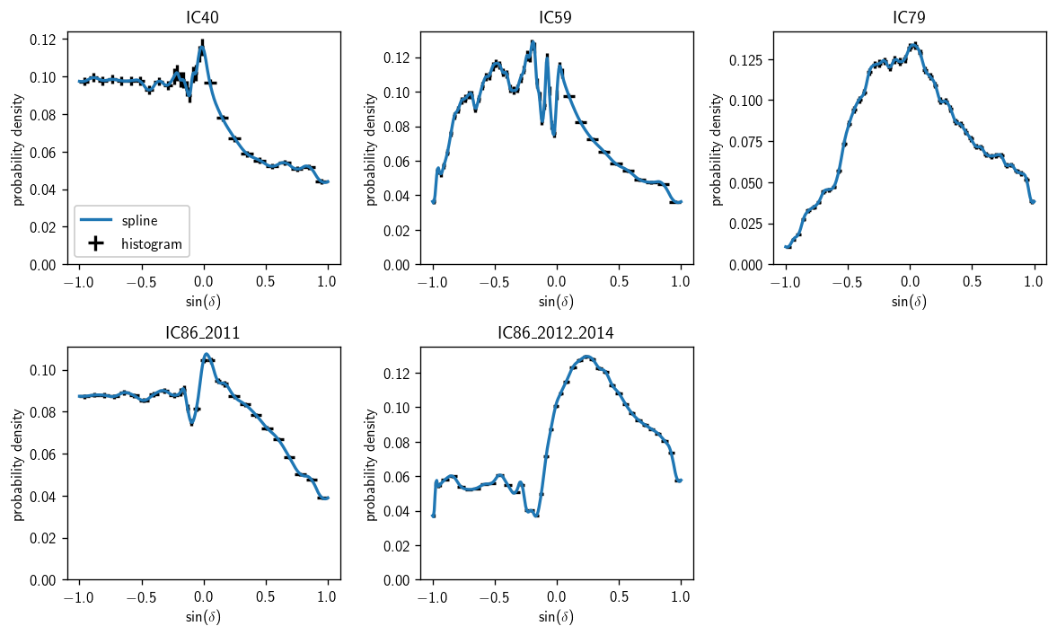
Background space PDFs
[5]:
fig, axs = plt.subplots(2, 3, figsize=(10,6))
axs = np.ravel(axs)
for (i, a) in enumerate(ana):
    ax = axs[i]
    hl.plot1d (ax, a.bg_space_param.h, crosses=True, color='k', label='histogram')
    sd = np.linspace (-1, 1, 300)
    ax.plot (sd, a.bg_space_param(sindec=sd), label='spline')
    ax.set_ylim(0)
    ax.set_title(a.plot_key)
    ax.set_xlabel(r'$\sin(\delta)$')
    ax.set_ylabel(r'probability density')
axs[0].legend(loc='lower left')
plt.tight_layout()
axs[-1].set_visible(False)
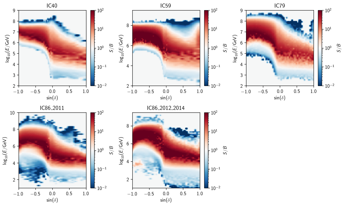
Energy PDF Ratios
Here we’ll demonstrate the plotting for \(\gamma=2\). First, the ratio splines that actually go into analyses:
[6]:
gamma = 2
[7]:
fig, axs = plt.subplots(2, 3, figsize=(10,6))
axs = np.ravel(axs)
for (i, a) in enumerate(ana):
    ax = axs[i]
    eprm = a.energy_pdf_ratio_model
    ss = dict(zip(eprm.gammas, eprm.ss_hl))
    things = hl.plot2d(ax, ss[gamma].eval(bins=100),
                       vmin=1e-2, vmax=1e2, log=True, cbar=True, cmap='RdBu_r')
    ax.set_title(a.plot_key)
    things['colorbar'].set_label(r'$S/B$')
    ax.set_xlabel(r'$\sin(\delta)$')
    ax.set_ylabel(r'$\log_{10}(E/\text{GeV})$')
plt.tight_layout()
axs[-1].set_visible(False)
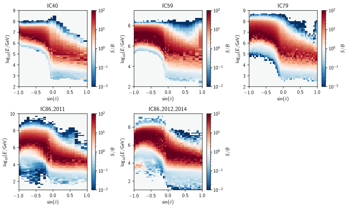
Ratio splines shown as contours:
[8]:
fig, axs = plt.subplots(2, 3, figsize=(10,6))
axs = np.ravel(axs)
for (i, a) in enumerate(ana):
    ax = axs[i]
    eprm = a.energy_pdf_ratio_model
    ss = dict(zip(eprm.gammas, eprm.ss_hl))
    things = hl.plot2d(ax, ss[gamma].eval(bins=100),
                       levels=np.logspace(-2, 2, 16+1),
                       vmin=1e-2, vmax=1e2, log=True, cbar=True, cmap='RdBu_r')
    ax.set_title(a.plot_key)
    things['colorbar'].set_label(r'$S/B$')
    ax.set_xlabel(r'$\sin(\delta)$')
    ax.set_ylabel(r'$\log_{10}(E/\text{GeV})$')
plt.tight_layout()
axs[-1].set_visible(False)

Finally, here are the underlying histogram ratios:
[9]:
fig, axs = plt.subplots(2, 3, figsize=(10,6))
axs = np.ravel(axs)
for (i, a) in enumerate(ana):
    ax = axs[i]
    eprm = a.energy_pdf_ratio_model
    hs_ratio = dict(zip(eprm.gammas, eprm.hs_ratio))
    things = hl.plot2d(ax, hs_ratio[gamma].eval(bins=100),
                       vmin=1e-2, vmax=1e2, log=True, cbar=True, cmap='RdBu_r')
    ax.set_title(a.plot_key)
    things['colorbar'].set_label(r'$S/B$')
    ax.set_xlabel(r'$\sin(\delta)$')
    ax.set_ylabel(r'$\log_{10}(E/\text{GeV})$')
plt.tight_layout()
axs[-1].set_visible(False)
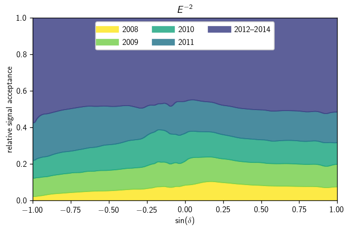
Signal acceptance parameterization
There are lots of ways to visualize the signal acceptance parameterization. Here we look at one approach to showing the relative time-integrated contribution from each dataset, as a function of \(\sin(\delta)\):
[10]:
def acc_to_hist (a, gamma=2, n_sindec=500):
    kw = dict (bins=(1,n_sindec), range=((gamma-.25,gamma+.25), (-1,1)))
    return a.acc_param.s_hl.eval(**kw)[gamma] * a.livetime
[11]:
fig, ax = plt.subplots()
gamma = 2
hs = np.array([acc_to_hist(a, gamma=gamma) for a in ana.anas])
shs = np.sum(hs, axis=0)
cm = plt.get_cmap('viridis')
colors = [cm(1 - 1. * i / len(hs)) for i in range(len(hs))]
labels = '2008 2009 2010 2011 2012--2014'.split()
hl.stack1d(ax, hs / shs, labels=labels, colors=colors, alpha=.85)
ax.legend(loc='upper center', ncol=3)
ax.set_xlabel(r'$\sin(\delta)$')
ax.set_ylabel(r'relative signal acceptance')
ax.set_title(r'$E^{{-{}}}$'.format(gamma))
ax.set_xlim(-1, 1)
ax.set_ylim(0, 1)
plt.tight_layout()
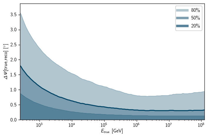
Angular Resolution
There are plenty of ways to plot the angular resolution, but I like to use histlite’s sliding binning feature:
[12]:
# create a histogram:
h = hl.hist_slide(
    # slide the bins 5 times along energy, hold them still along angular error
    (5,1),
    # 2D histogram of true energy and angular error in degrees
    (sig.true_energy, sig.dpsi_deg),
    # E^-2 weighting
    sig.oneweight*sig.true_energy**-2,
    # from 200 GeV to 100 PeV, plus a bit so there are bins at the endpoints
    bins=(10**np.r_[2.25:8.26:.25], np.r_[0:10.01:.01])
)

# normalize along the angular error axis
h = h.normalize(1)
# get 20%, 50%, and 80% quantiles
h2 = h.contain(1, .2)
h5 = h.contain(1, .5)
h8 = h.contain(1, .8)
Sometimes I like to use a certain color scheme, cy.plotting.soft_colors. We’ll use its version of blue here.
[14]:
soft_colors = cy.plotting.soft_colors
soft_colors
[14]:
['#004466', '#d06050', '#2aca80', '#dd9388', '#caca68']
We’re ready to make the plot. First I’ll apply hl.fill_between 3 times to layer the quantiles with transparency. Then I’ll create legend handles with approximately the correct transparency-flattened colors:
[15]:
fig, ax = plt.subplots()

# plot quantiles, emphasize median
color = soft_colors[0]
hl.fill_between(ax, 0, h2, color=color, alpha=.3, drawstyle='line')
hl.fill_between(ax, 0, h5, color=color, alpha=.3, drawstyle='line')
hl.fill_between(ax, 0, h8, color=color, alpha=.3, drawstyle='line')
hl.plot1d (ax, h5, color=color, lw=2, drawstyle='default')

# trick to get the legend handles colored right
# try testing what happens if you just do hl.fill_between(..., label='...')
nans = [np.nan, np.nan]
ax.plot (nans, nans, color=color, lw=5, alpha=1 - (1-0.3)**1, label='80\%')
ax.plot (nans, nans, color=color, lw=5, alpha=1 - (1-0.3)**2, label='50\%')
ax.plot (nans, nans, color=color, lw=5, alpha=1 - (1-0.3)**3, label='20\%')

# labels etc
ax.semilogx()
ax.set_xlabel(r'$E_\text{true}$ [GeV]')
ax.set_ylabel(r'$\Delta\Psi[\text{true,reco}]~[^\circ]$')
ax.set_xlim(h.bins[0][1], h.bins[0][-2])
ax.set_ylim(0)
ax.legend(loc='upper right')
plt.tight_layout()
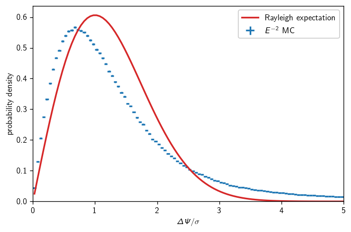
Angular errors vs Rayleigh
There’s been a lot of talk recently about how our signal space PDF isn’t really very accurately modeled as a circular 2D Gaussian. Let’s compare MC and analytic expectation, integrating over an \(E^{-2}\) spectrum and all neutrino directions:
[16]:
fig, ax = plt.subplots()
h = hl.hist(sig.dpsi/sig.sigma, sig.oneweight*sig.true_energy**-2,
            bins=np.r_[:180:.05]).normalize()
hl.plot1d(ax, h, crosses=True, label=r'$E^{-2}$ MC')
x = h.centers[0]
ax.plot(x, stats.rayleigh.pdf(x), label='Rayleigh expectation')
ax.set_xlim(0, 5)
ax.set_ylim(0)
ax.set_xlabel(r'$\Delta\Psi/\sigma$')
ax.set_ylabel(r'probability density')
ax.legend()
plt.tight_layout()